written by David Steffen
In 2020, on April 1st, we’ve had a recurring gag on the site where we “rebrand” by replacing the banner from a list of joke banners that sound kindof like “The Grinder” but pick a different title, different subtitle, and different logo. There were nine banners created by our original banner artist M.S. Corley (with a little help from me with my mad MS Paint skills for a couple of them). See the previous April Fool’s Recap for those original 9 banners.
In case you didn’t happen to be on the site that day or you didn’t have the time to try to see them all, you can see them all here right in this recap.
We started it in that particular year because everyone was extremely stressed with the still-new pandemic, mass layoffs, social isolation, and we thought that if we could make someone laugh it would be a little something good. Since we had the banners we’ve been running the same recurring gag for the few years since then, and people still seem to enjoy them and there’s always someone new finding them.
This year again we are super extra stressed with the *gestures wearily at the everything*, we thought it would be a good time to expand and add more all new banners.
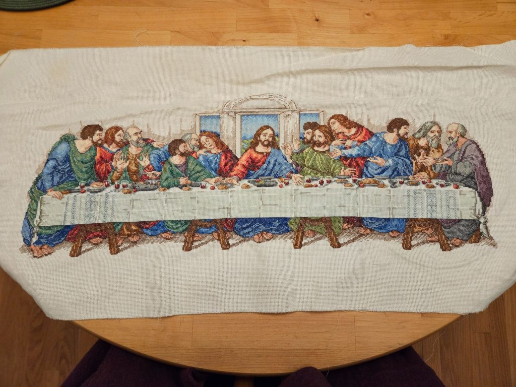
At the time of our last recap, the main logo on the site was a meat grinder:
Title: “The Grinder”
Subtitle: “Milling your submissions into something useful…”
Logo: meat grinder with paper with unreadable writing feeding into it, and loose sheets flying through the air above the text
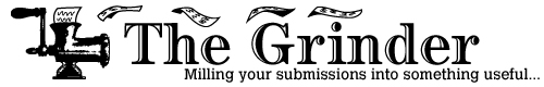
Since the last recap we have actually changed our main banner a couple of times. We decided that maybe the meat grinder wasn’t the most welcoming image, especially for people who don’t eat meat. For a short while we actually had a logo that was a sandwich (you know, a grinder like a sub sandwich?):
Title: The Grinder
Subtitle: Munching your submissions into something useful…
Logo: sub sandwich, with a toothpick and an olive on top, and sandwich ingredients are flying through the air above the text.
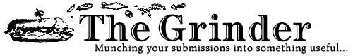
This last for a few months, but we ended up changing the main logo again to a coffee grinder. While, yes, there are people and cultures that don’t drink coffee, coffee is often associated with writers toiling away at their work so the image seemed to fit:
Title: “The Grinder”.
Subtitle: “Brewing your submissions into something useful…”.
Logo: old-fashioned manual coffee grinder, and coffee beans are flying through the air above the text.
Although some of these might be funny, these were actual logos used on the site for a period of time.
The Joke Banners
Again, see the previous April Fool’s Recap for the original nine joke banners. Those stayed in the rotation, but we added nine all-new banners for a total of 18 banners. Every time the page loaded after you took some action it would load one randomly from the 18.
The Grounder
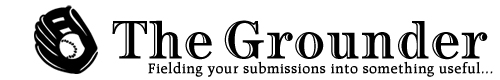
Title: The Grounder
Subtitle: Fielding your submissions into something useful…
Logo: A baseball mitt holding a baseball.
This one is less silly than many others, but the word was actually so close that it made sense to include it.
The Linger
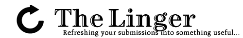
Title: The Linger
Subtitle: Refreshing your submissions into something useful…
Logo: a circular arrow shape, reminiscent of the logo used on most web browsers to refresh a page
This was a joke about the site itself, and got responses from the users on social media like “called out!”. Users of the Submission Grinder track their own submissions on the site, but then each user can also see new anonymized (except for acceptances if the user chooses to show some name) responses from other writers. If writers are anxious about the results of a particular submission, they may refresh the page over and over again. This is something that we see writers talking about pretty often, how it’s hard not to just keep refreshing, so this banner was very relatable for people!
The Minder
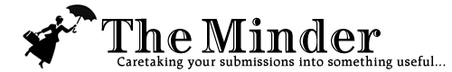
Title: The Minder
Subtitle: Caretaking your submissions into something useful…
Logo: The silhouette of Mary Poppins, wearing a hat and an old fashioned dress, carrying a bag in one hand, and flying through the air using an umbrella in her other hand.
The Pomander
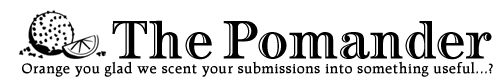
Title: The Pomander
Subtitle: Orange you glad we scent your submissions into something useful…?
Logo: A pomander of the variety that is an orange studded with cloves. A slice of orange sits next to it, and loose cloves lie around it
I did not know what a pomander was, though I had heard of them. They were meant to ward off bad smells that were thought at the time to be the cause of illnesses.
But what really sold me on this one was the pair of terrible puns. (Yes the subtitle strays from the usual subtitle pattern, but I think that helps the comic effect by subverting expectations)
The Flinders
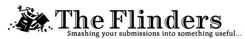
Title: The Flinders
Subtitle: Smashing your submissions into something useful…
Logo: Based on the main coffee grinder image, but this one has been smashed to pieces, and coffee beans are lying all around.
This one has been in my head since we did the first April Fool’s run as one that I wanted to do if we did another round. I just think the word “flinders” is funny. I don’t know why.
The Go Mind Yer

Title: The Go Mind Yer
Subtitle: It’s none of your dang business!
Logo: A closed door with cartoon sound lines that imply that the door has just been slammed shut.
As in “Go Mind Yer Own Business”. I like this one in part because it reminds me of my grandmother-in-law who when in a mood would say “It’s none of your damned business” pretty often.
The Gyrer
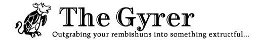
Title: The Gyrer
Subtitle: Outgrabing your rembishuns into something extructful…
Logo: The mock turtle from Alice’s Adventures In Wonderland, a sea turtle/cow chimera with the body and front flippers of a sea turtle and the head, back legs, and tail of a cow.
I do love Alice in Wonderland, and the Jabberwocky in particular. “Gyrer” as in “gyre” from “‘Twas brillig and the slithy toves did gyre and gimble in the wabe”. And “outgrabing” as in “and the mome raths outgrabe”. The other two nonsense words were portmanteau words of my own devising. “rembishuns” as in “rejected submissions”. “extructful” as sort of a combination of “useful” and “instructive”, but “instructive” is reversed, because your submissions don’t instruct you, they instruct others, so since the instruction is outgoing instead of incoming, the “in” goes to “ex” and becomes “extructful”.
The NANDer

Title: The NANDer
Subtitle: Gotta not catch all them rejections!
Logo: A sphere with a dark top half and a light bottom half, separating the two colors is an image of a NAND gate.
This is a pretty niche geek joke, and my second favorite. I’m curious how many people got this one without me explaining it.
What is a NAND gate?
Logic gates are components in computer engineering and computer software that can be used to cause different behaviors. The easier ones to understand are the AND gate (which will activate if all of its inputs are on), the OR gate (which will activate if any of its inputs are on), and the NOT gat (which will activate if its input is not on). There are also the NOR gate (which is a combination of an OR and a NOT gate, and will activate if none of the inputs are on) and the NAND gate (which is a combination of an AND and a NOT gate, and will activate if not all of the inputs are on). I like the NAND gate best because you can technically build all the other gates if you only have a NAND gate. The image on the sphere is a NAND gate, the two lines on the left represent the inputs to the gate. The single line on the right represents the single output of the gate. The “D” shaped object is an AND gate, the circle immediately after it is a NOT gate, so combined they make a NAND gate.
How does a NAND gate apply to this joke?
Of course the sphere is meant to look like a Pokéball and the subtitle is meant to be a parody of the Pokémon catchphrase “Gotta catch ’em all!”. Writers who are using the site and trying to get published, it can serve them well if they enthusiastically send submissions out in an ongoing basis, you could look at it as a sort of Pokémon creature collection scenario. You expect to collect many many rejections in the course of submissions, which is a normal part of the submission process as frustrating as that can be. The actual catchphrase “Gotta catch ’em all!” could be represented by an AND gate, because you have not met your goal unless all the inputs are activated (if you see “collecting a creature” as a yes/no input). When submitting, you should be prepared to collect many rejections but of course you don’t want them all to always be rejections, so you don’t want to catch all rejections. In the end, a writer can be seen as successful if they get some acceptances, no matter how many rejections they had to get to get there. So, a NAND gate seemed appropriate for this scenario, to have a chance of success you have to be ready to get a lot of rejections but with the goal of not getting only rejections, hence the modified phrase. I thought about simply negating the original catchphrase as “Gotta not catch ’em all!” but I thought it was unclear what “’em” I was referring to, so a slight rearrangement makes it more explicit, with “Gotta not catch all them rejections!” and yes the modified phrase is a little clunky, but in this case I thought it was clunky in a funny way so it was perfect.
The Pander
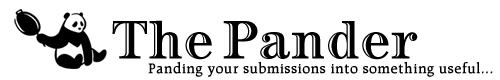
Title: The Pander
Subtitle: Panding your submissions into something useful…
Logo: A panda bear sitting on its butt, holding a frying pan in one front paw.
This is my favorite one. I laugh whenever this one comes up again. It’s a pander bear! And it’s holding a frying pan! It’s such a terrible joke, and I love it entirely too much, and I hope you either love this terrible joke, or groan at how terrible it is (which just makes me laugh more).