Adventures in Amateur Art (Drabblecast Edition)

written by David Steffen

Introduction

I’ve always felt drawn to creative endeavors of various kinds. When I was a kid, I wanted to be a cartoonist. When I was in high school I wanted to program video games. I tend to wander from one creative medium to another, drawn from one to the next by the prospect of something new and interesting. Writing has been the odd duck in this string of attempts in that I actually have stuck with it for years, and I feel like I’ve gotten to a point where I’m pretty good. I’m not planning to quit any time soon. Yet I’m still always looking to explore other mediums just to keep myself from getting too comfortable, because that way lies boredom. If you believe in Muses, at least in a metaphorical sense, I like to say “My Muse, she be fickle.” I’ve tried to force her to work for me, and that always fails. She just leaves if I try that, and will stay away until I stop trying to give her orders. I am much happier, and much more productive if I just go with the flow, and let her drive the car.

Anyway, the point is that I am now, as ever, having fun trying out new creative fields. At the moment I’m dabbling in story illustrations. I’ve thought about doing something like this for a while. In particular, I think it’d be fun to illustrate my own stories, or the stories of friends.  But I have never felt particularly driven to do so. But then along came the perfect opportunity, as offered by the Drabblecast!

Drabblecast is working their way up to a major site upgrade. As part of this grand project, Bo Kaier, their art director, has kicked off the Drabblecast Art Reclamation Project (follow the link for all the juicy details). Since about episode 130 of their podcast, they’ve had illustrations for every single episode, provided by volunteer artists. When they move to the new site, in an effort to make everything more uniform and to provide shiny new content to attract listeners, Bo has asked for volunteers to fill in the episode artwork for all those older episodes. Anyone who feels they might like to take a crack at it, there are still more than 50 episodes unclaimed–follow the link. The deadline stated there is August 1st, but that’s a very soft deadline. They’re currently shooting for mid-September launch, and anything they don’t have artwork for at that time… will just have to go without art for now. So, I’m sure they’d love to have whoever volunteer.

I decided to volunteer for 3 episode artworks for now, and I’ve completed and submitted by the time of writing this post. These will go up on the Drabblecast site when it’s ready to launch, but I’ve asked for permission to show the artwork I’ve done here. And, for those who might be interested in such things, I will describe how I did each of these pieces of visual art from start to finish.

The Art

“Malish” by Mike Resnick

“Malish” is a story about a deal with the devil. It’s a bit out of the ordinary for that type of story in that the main character is not the one who makes the deal. The main character is Malish, a racehorse, and his owner has made a deal with the devil, described in the story only as “the gnarly little man”. The devil comes to claim the owner, and while he’s there decides to nab the horse as well. But Malish won’t be taken so easily.

1. What to depict?
The first thing I had to decide is what I wanted the illustration to depict. I chose this specific story because I figured that I could do the image of the horse justice with the “pet cartooning” method that I was playing with last year. So, of course, I knew the horse would be in the image. But I wanted to get at least some hint of the speculative element into the image as well. In this case, the only speculative element is the presence of the devil, described as “the gnarly little man”. One of the biggest moments in the story is when the gnarly little man first tries to take Malish in the stable, so I decided to illustrate that.

2. Picture of a horse
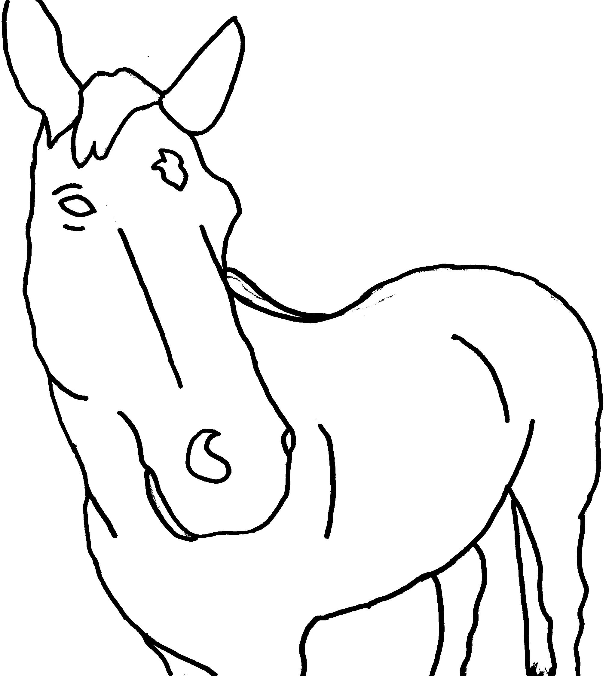
Next, I needed to actually get started on the image. In particular, I needed to get the outline of the horse. My method for doing this is perhaps not the most sophisticated, but I think it worked well enough. First I needed a picture of a horse. I mentioned this to Bo and, he is such a nice guy, he contacted another Drabblecast fan and got me a few home pictures of one of her horses. Of the three, one stood out to me as a particularly interesting image, so I picked that. I like it, because the horse is looking right at the camera. You can see the horse’s face very clearly and it is the most prominent part of the image, but you can also see the horse’s body in the background. It has some interesting perspective proportions, with the horses hindquarters appearing smaller than its head.

3. Cartoon outline of the horse
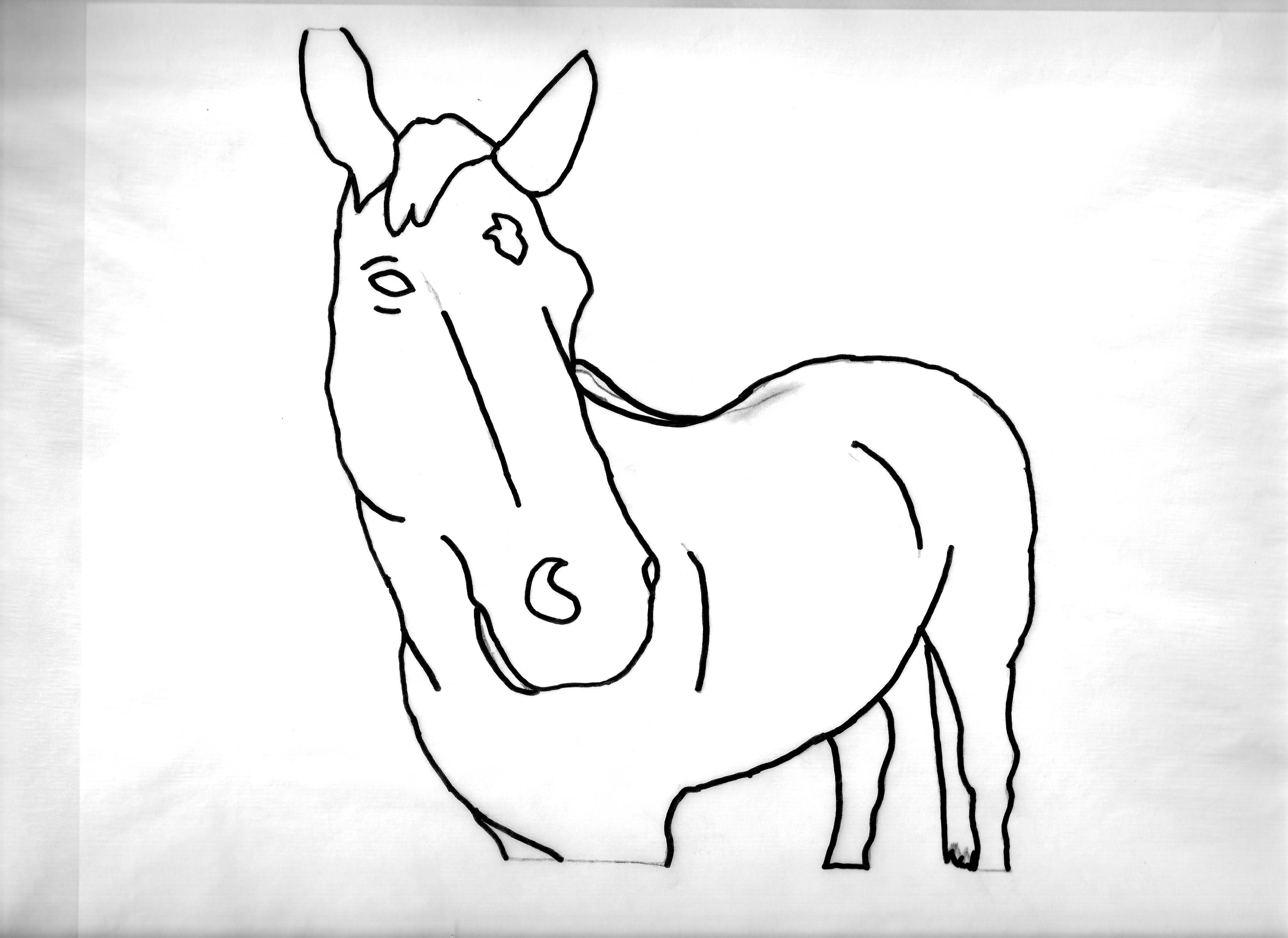
Now I needed the bold line drawing of the horse, to give it a cartoon feel, with digital colors to be added in later. I can draw relatively well in freehand, but I decided that, in order to do the horse image justice, I would do some good old fashioned tracing. I printed out the image, overlaid it with tracing paper, and traced the boldest lines with a nice thick 1.2mm felt pen. The lines on the outer edges were easiest to see, as they showed through the tracing paper most clearly. Some of the others I had to just eyeball. Note, I added some lines that aren’t strictly lines in the photo, to suggest the shape of the horse’s body.
4. Binary image of outline of the horse
One trouble is that, when I scan this nice clean outline, the scanned image that ends up on my computer is not perfectly clean. The scanner picks up some of the paper’s texture, etc… So, to get a really clean image, I opened it up in Microsoft Paint, and saved it as a Monochrome Bitmap. This format only stores white and black, nothing in between, what computer vision folk call “binary thresholding”. Saving it as that leaves some extraneous speckles, but by zooming upsize in Microsoft Paint, I could clean those up with the eraser tool.
5. Sketching the hand
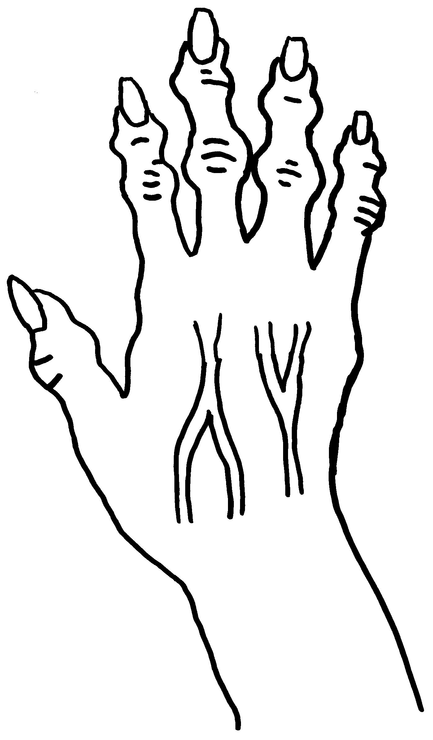
And then on to the hand. I drew it in a sketchbook freehand using my own left hand as a model. I’m very happy with how the hand turned out, as it’s one of my better attempts at realistic freehand drawing of human anatomy. For now, drawing the hand as close to my hand as I can.

6. Gnarlifying, cartoon outline, binary image
From the sketch I had to get back to a similar type type of cartoon image as the horse. Tracing paper, thick felt tip. And, remember, the hand is supposed to be the hand of the gnarly little man, so at this stage I embellished from the original image to make it gnarly. I tried to add swelling to all of the knuckles, and while I was at it, extend the fingernails and add prominent veins. And then I repeated the same steps I’d used for the horse to get a clean binary image.

7. Combining cartoon horse with cartoon hand
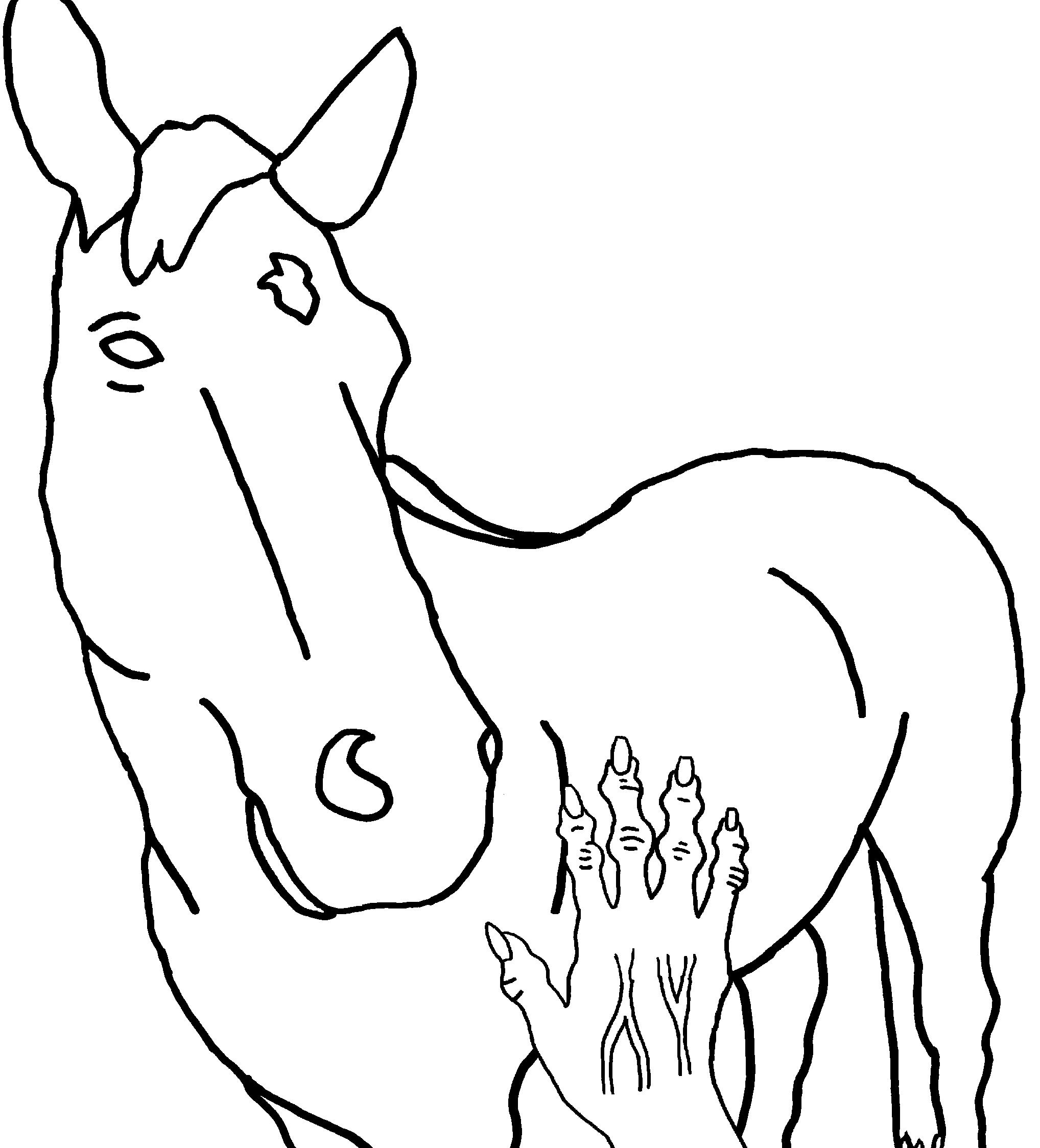
Now to combine the images, resizing, overlaying. Using Microsoft Paint for this again.
8. Simple coloring of image
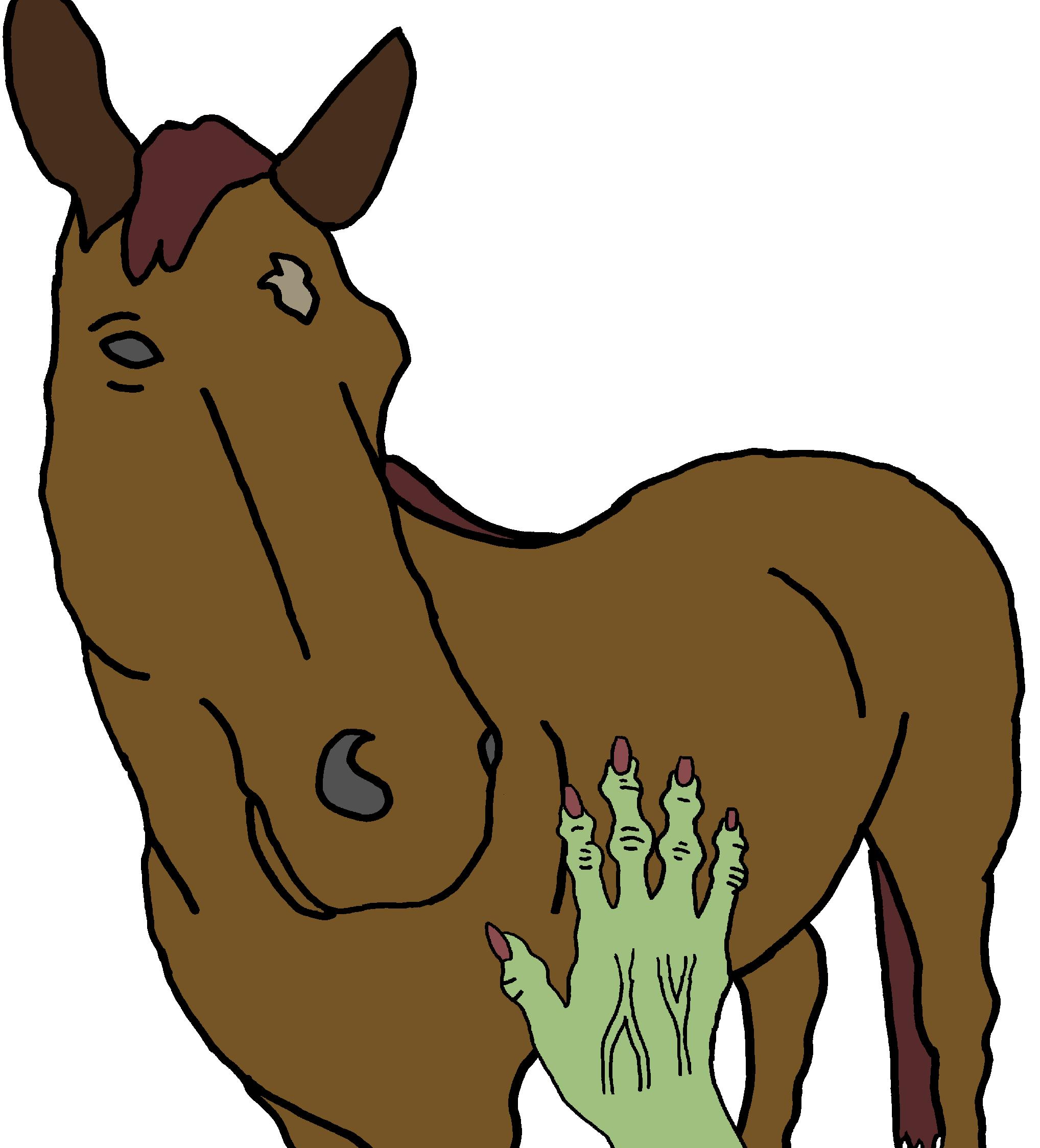
Simplest coloring step, just using Microsoft Paint’s basic paint bucket. Tried to match colors to photograph. Tried making the hand green to begin with. The story did not specify the color and I wanted it to appear somewhat “other”.
9. Color shading of image
That last coloring scheme was rather too simple, so tried to add a comic style 2 step shading to the main body of the horse as well as to the hand. To make the shaded areas look like a differently lighted patch of the same color, went into Microsoft Paint’s custom colors, started with the original color, and simply dialed the Saturation level down. Since the new shading levels suggest the shape of the horse’s body, I removed the black contour lines I’d added to suggest that shape.
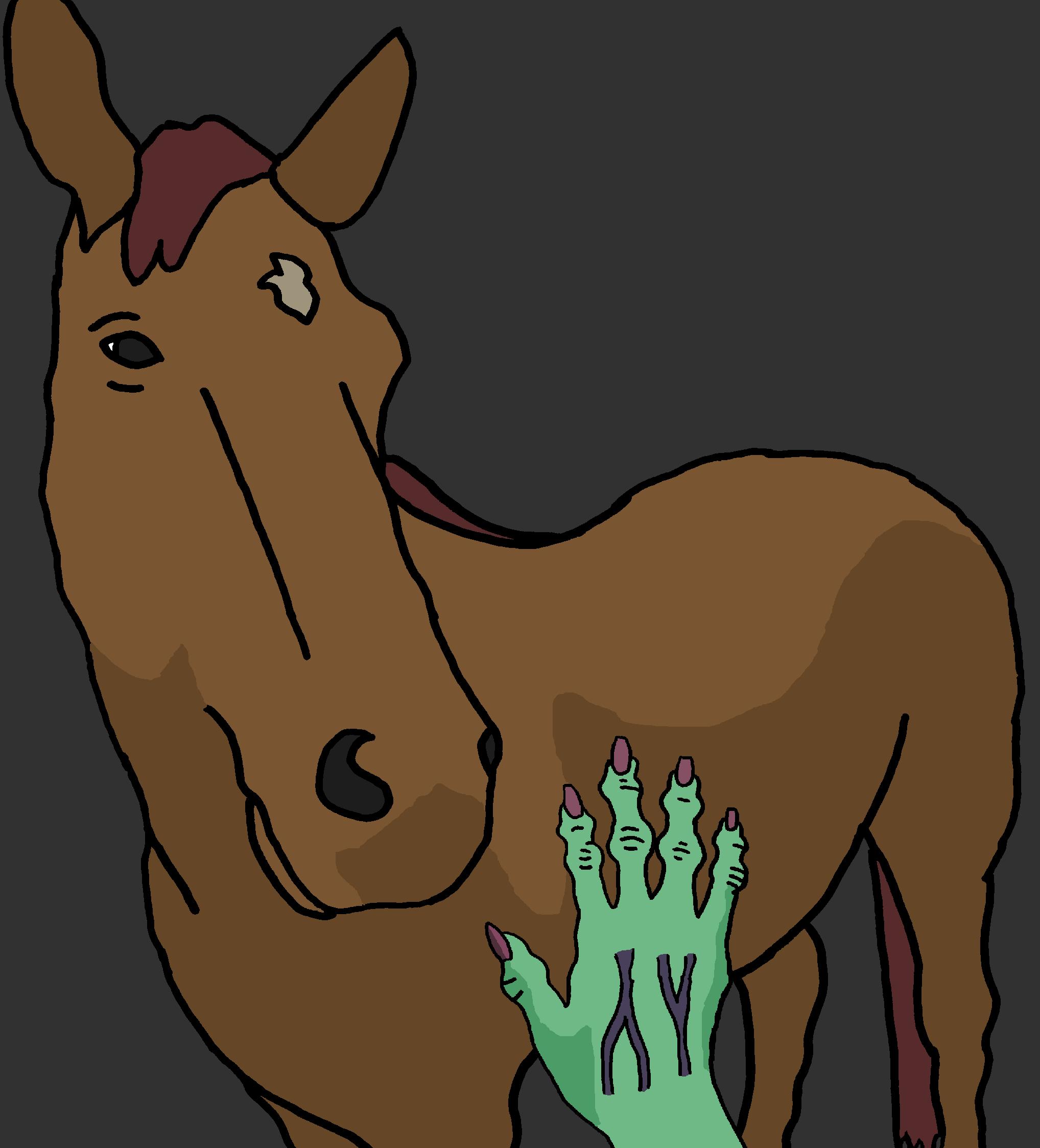
10. Extra Shading, Red Hand
I changed the color of the hand from green to shades of red because one person, upon seeing the image, immediately said “Is that a zombie and a donkey?” Okay, so green does tend to suggest zombies, so may as well change it. Confusing the horse for a donkey though… Not much to be done about that but educate him on the difference between donkeys and horses. 🙂
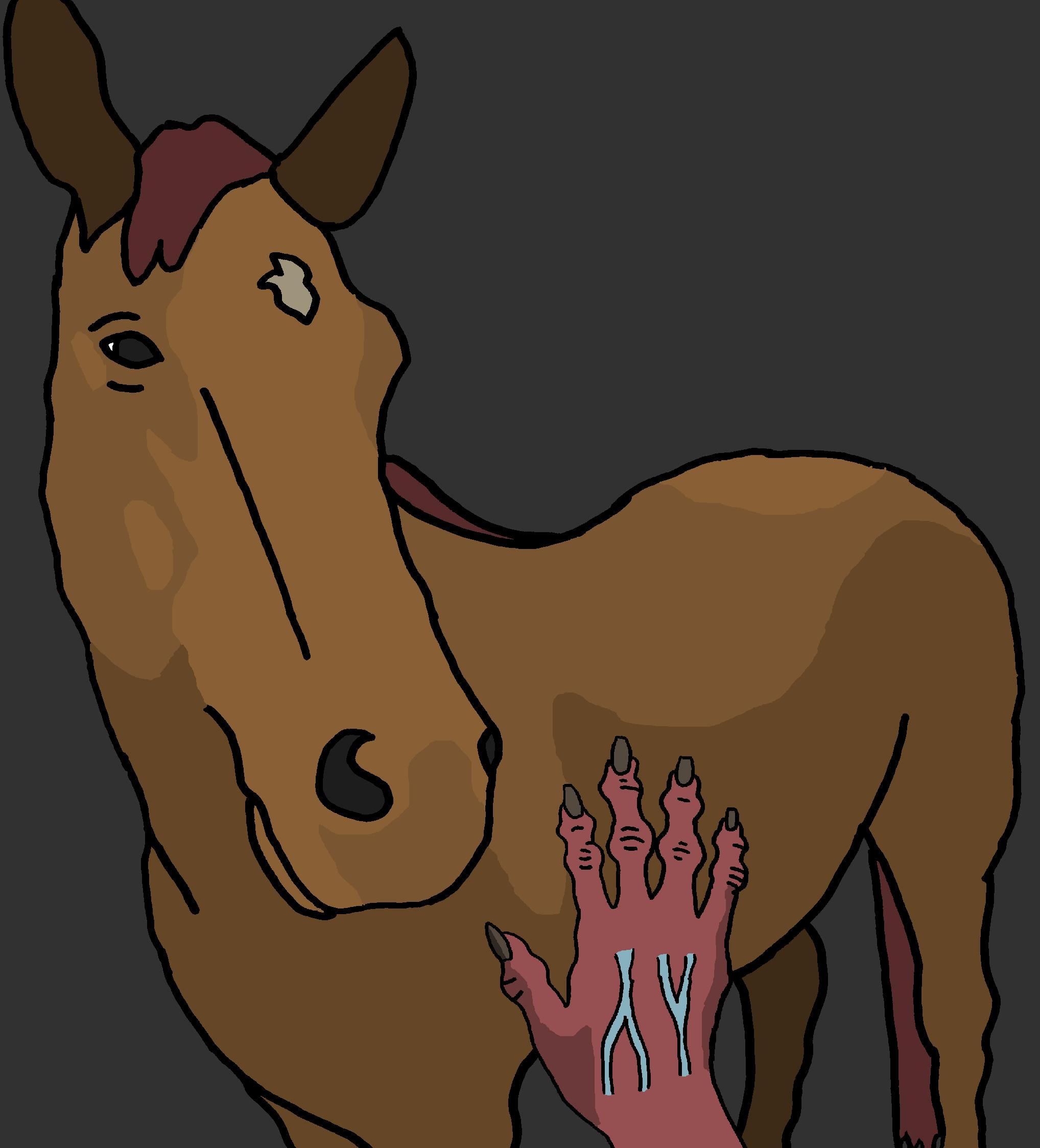
11. Final copy
Had to make some more changes before the final draft. In the original one, the hand is rather hidden behind the Drabblecast logo. There wasn’t anything to do but to shrink the image down and draw extensions. These extensions go outside the boundaries shown in the photo so I had to estimate what the rest would look like. I also added in a new background color with a gradient so it isn’t so uniform, and added in the title. I got some help from Bo on the title formatting, adding in the darker boundary to the letters, which i haven’t figured out how to do. That’s good because the font didn’t pop out of the background clearly enough without that.

“Marbles” by Ayn Sauer

“Marbles” is a dark story from a child’s point of view. This is one obsessive little girl, fixated upon her button collection. She plays by herself and sorts the buttons by size, color, number of holes. A neighborhood boy invites her over to play, and shows her his stuffed bunny with button eyes. Big mistake, as she immediately extracts one of the button eyes for her collection. And that’s not the end.

1. What to depict?
Decided to do this one in a child’s art style. I figured it could be a simple crayon drawing, perhaps a self-portrait drawn by the girl at a psychiatrist visit after the fact. And, what better moment to show, but the very moment when she has extracted the button eye. So I decided I’d draw the girl with the button, and the boy with the bunny within a child’s simple house shape. A bit later in the story, the boy’s cat plays an important role, so the cat’s in the image as well.

2. The drawing
I learned a lesson from the Malish illustration, to leave room at the bottom for the Drabblecast logo, so I made a grassy lawn down there. Simple house outline. Girl with triumphant smile and pose, holding up the button. Boy wailing and crying with one-eye bunny in tow. Cat off to the side. Instead of making an electronic font, I decided to draw the title and episode number into the crayon drawing itself. And, since the episode number has a zero in it, I made the zero into a button.
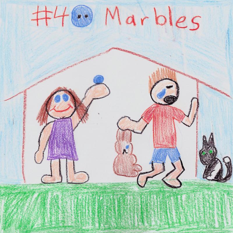
3. Final copy
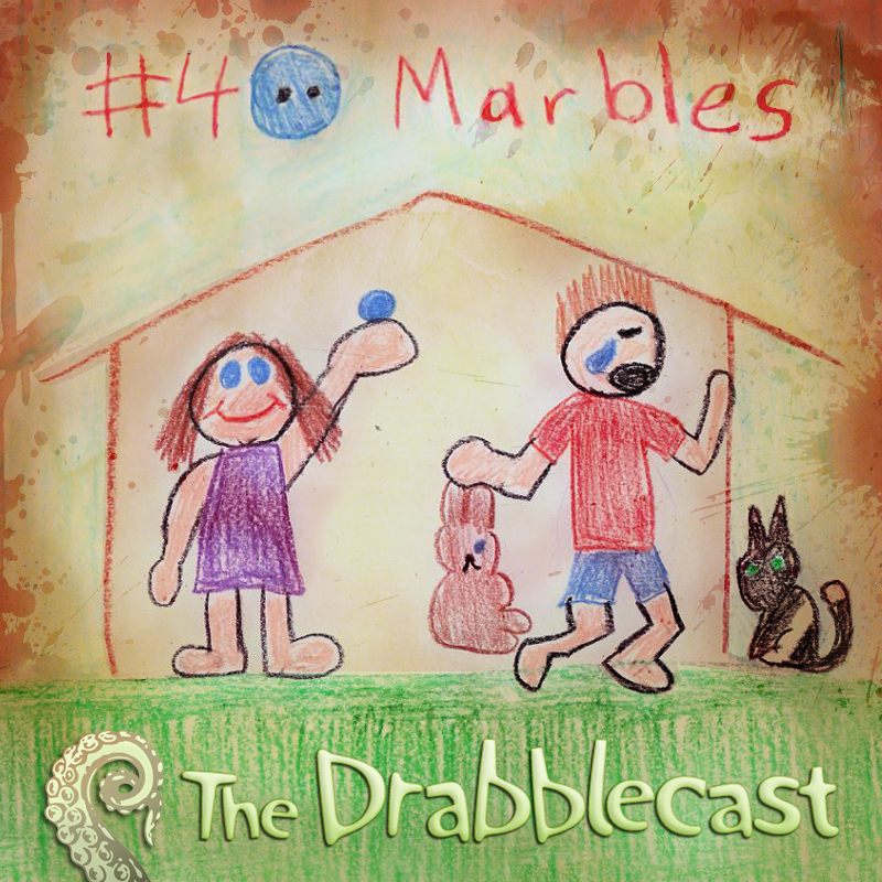
I handed the image off to Bo, and he did some treatments to it, which I thought turned out well.
“The Fine Point” by Gary Cuba

“The Fine Point” has a very classic SF feel to it. In the story, someone has made a profound discovery about the world we live in–the world is made up of a limited set of repeating hexagon-shaped tiles. He proves this by marking a couple of nearby forested locations. Taking a photo from these two locations creates the exact same photograph. Evidence, he says, that rather than making every bit of Creation completely unique, God has used a repeating set of tiles.

I volunteered for this one because Gary’s a good friend of mine. I get a kick out of his stories and I thought it’d be fun to illustrate one of them to share with all the Drabblecast listeners.

1. What to depict?
This one was a bit trickier than the others to try to decide what to do. I wanted to get the speculative element into the illustration, but the speculative element in this case is extremely subtle. It manifests in the story by showing the two photographs side by side, but that by itself wouldn’t make a very compelling illustration to me. Instead, I decided that rather than illustrating an explicit scene/even in the story I would try to illustrate the concept of the story in a more abstract way. I decided that one way that I could manage to do this would be to try to do an image that might interest the great M.C. Escher, blurring the boundaries between reality and unreality. Since the pictures in the story were a forest, I thought I’d start with a forest.

2. Find a forest picture
I’d fully intended to take a forest picture with my own camera. But, that didn’t end up working out. Whenever I would head out to a nearby park, something would stop me from getting the picture. Sometimes it was weather. Once I got all the way there only to realize my camera batteries were too dead to take even a single picture. So, instead, I searched online and found at Burning Well, a website that has public domain images.

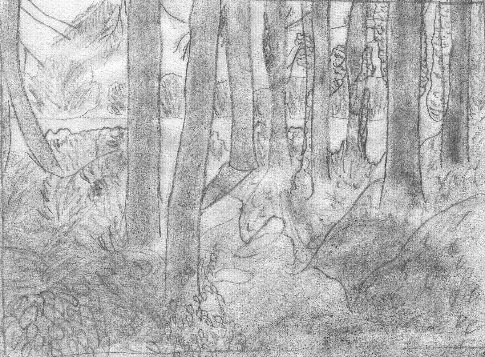
3. Sketch the forest
Hey, look, another use for tracing paper! :) I printed out the photo, then laid tracing paper over it. From that I was able to get the boldest outlines, the starkly contrasting tree trunks, the edge of the treeline in the background. There were a lot of details I had to doodle out by eyeballing it, all the leafy details especially.
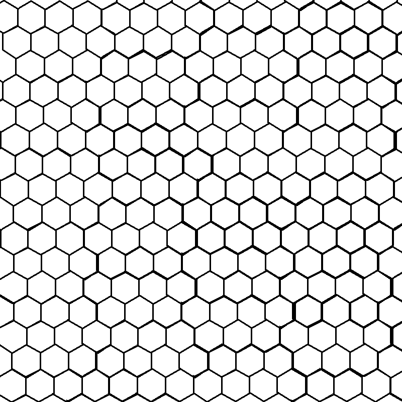
4. Lay out hexagon pattern
Just found a single hexagon and repeated the pattern until I’d filled the area. In GIMP, I made the spaces between the grid transparent. I wanted some hint of the hexagon tiles in the story, so that the illustration could more effectively bring the story to mind.
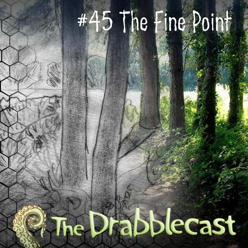
5. Combine, with layers
Okay, now to combine three layers together with selective transparency effects. Again, using GIMP.
First, the sketch on the bottom layer, no transparency.
Next, the photograph on top of that, with a radial transparency to make it look like the photograph has bled away in a circular pattern.Â
Next, the hexagon pattern. This one with a square transparency pattern, so that the hexagon just bleeds in at the very edge.
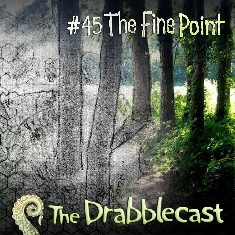
6. Final copy
I couldn’t quite figure out how to get the title just right, so I handed it off to Bo and asked him for help. He worked his magic, and made the title work very well with the image. Note that the new title even has a color gradient from gray to green, that matches the image. Perfect.
Sale! “The Quest Unusual” to Daily Science Fiction

written by David Steffen

My streak of good fortune continues with a third sale in quick succession!

The story:Â “The Quest Unusual”, a story about a strange… knight?

The magazine:Â Daily Science Fiction.

I’m particularly excited about this one, since Frank Dutkiewicz and his reviewer cronies have worked very hard to provide reviews of Daily Science Fiction for Diabolical Plots. I’m looking forward to being involved on the fiction side.


Good news! Another new sale, thus reaffirming my irrational superstition that my sales always come in pairs. This time the story is “The Infinite Onion”, an improbable SF story about a research company that is trying to find new ways to profit from portals to parallel worlds. The venue is AE Canadian Science Fiction Review. Huzzah! I am excited! That is all. 🙂 -David Steffen

Sale! “Fruitful” to Digital Science Fiction

written by David Steffen

I don’t often post about myself but I wanted to share some good news. I’ve sold my short story “Fruitful” to Digital Science Fiction. I’m very pleased that this has happened now. I was getting rather down about the writing, more than a year having passed since the last non-reprint sale.

I’ll post more information when it’s available, but the story is an off-world future SF story on a world with robot nannies where reproduction is the primary currency. I hope folks like it.

It is slated to appear in Digital Science Fiction’s 2nd issue, in July. DSF is planning to have a monthly anthology release, each one with 10 new science fiction stories. They’ve released the table of contents for their first issue, and they’ve gathered some familiar names, such as Ian Creasey, Ken Schneyer, David Tallerman. I’m looking forward to reading it!

The Best of Pseudopod 2010+

written by David Steffen
On November 9, 2009 I posted my very first “Best Of” podcast list, the Best of Pseudopod, which was based on Pseudopod episodes 1-167 and flash episodes 1-22. Well, I’m still listening and still enjoying myself, so I figured there’s no reason I can’t make another list. I expect this will become a yearly thing, and will usually cover everything within 1 calendar year. This one will be a tiny bit different because a bit more than a year has passed since my last, which is why this is 2010+. It will cover episodes 168-219, 60 stories total (because there are a few episodes with more than one story).

Pseudopod reached landmark episode 200 during this time period, and this range of episodes includes my premier on Pseudopod, episode 169 “The Disconnected”. In addition, I received another acceptance letter from them just a few weeks ago for my flash story “What Makes You Tick”, which should appear some time in 2011. Now, on to the list.

Instead of ten in the list, I’m going to include 10% of the total and make it a Top Six (plus honorable mentions).

If you like this list, check out my other “Best Of” articles.

1. The Snow-White Heart by Marie Brennan
read by Ben Phillips

I love reimagined fairy tales, and this may be my favorite of all. This is a reimagining of Snow White. Finally, a story that explains why she’s so darn pale, and why she lives with seven strange little men.

2. Ankor Sabat by C. Deskin Rink
read by Ben Phillips

A man on an all-consuming quest to save his wife from the evil cult that has taken her, so many years ago. This starts a little slowly, but I enjoyed it enough that it didn’t bother me. The story went on just a tiny bit longer than it needed to, but other than, it was great.

3. The Dark Level by John F.D. Taff
read by Ian Stuart

Near empty parking garages are one of the creepiest locations in the modern world, and this story takes that idea and magnifies it. There’s something not quite right about this particular garage. Enhanced greatly by the amazing Ian Stuart’s reading, you’ve got to check this out.

4. The Mother and the Worm by Tim W. Burke
read by Paul S. Jenkins

This picks up where the The Garden and the Mirror (another Pseudopod story by the same author) left off. This stars the same two main characters, the yantra master and the woman who wants to use his power.

5. The Horror of the Heights by Arthur Conan Doyle
read by Alasdair Stuart

Sir Arthur Conan Doyle is, of course, most well known for his Sherlock Holmes mysteries, but apparently he did some supernatural horror as well. This is the tale of a daring man who flies his plane to impossible heights, and the chronicles of his visit.

6. Spirit of Nationalism by Richard Marsden
read by Mike Bennett

Historical fiction tends not to suit my fancy, but I really enjoyed this one, supernatural horror story taking place during Napoleon’s invasion of Russia. The plot seemed familiar, but it didn’t go where I expected.

Honorable Mentions

1. Corvus Curse by Barry J. Northern
read by Ian Stuart

Note that the author is also editor of Cast Macabre, a new horror fiction podcast, which I am currently listening to. Expect a Best Of Cast Macabre, coming soon.

2. Turning the Apples by Tina Connolly
read by Cayenne Chris Conroy

3. The Evil-Eater by Peadar O Guilin
read by Wilson Fowlie


On November 9, 2009 I posted my very first “Best Of” podcast list, the Best of Pseudopod, which was based on Pseudopod episodes 1-167 and flash episodes 1-22. Well, I’m still listening and still enjoying myself, so I figured there’s no reason I can’t make another list. I expect this will become a yearly thing, and will usually cover everything within 1 calendar year. This one will be a tiny bit different because a bit more than a year has passed since my last, which is why this is 2010+. It will cover episodes 168-219, 60 stories total (because there are a few episodes with more than one story).

Noms: John W. Campbell (and Hugo)

written by David Steffen

Hello, everyone! I wanted to bring to your attention that this is the first year that I am eligible for the John W. Campbell Award for Best New Writer. My eligibility opened up because of publication of my story “Turning Back the Clock” in Bull Spec #3, so I figured I’d pander a bit for nominations, and while I’m at it, Hugo noms.

How can I vote?

Nominations–You can vote any time between now and March 26th. You are eligible to vote if you had an attending/supporting membership to last year’s World SF convention (AussieCon) or this year’s World SF convention (Renovation). You don’t actually have to attend to be able to vote–you can buy a “supporting” membership for $50. When you’re ready to vote the online or print ballots are available here. You can nominate 0-5 entries for each category. A list of categories is also available at that link.

Voting–Some time after the nomination round votes are counted, they’ll open up for the main voting. You’re eligible for this only if you’re an attending supporting member of this year’s World SF convention (Renovation)–not the difference in eligibility rules from the nomination round. There’s no link yet, but presumably it will be in a similar place to the nomination voting ballot.

What Categories?

John W. Campbell Award for Best New Writer

I (David Steffen) am eligible for this one because of my qualifying sale to Bull Spec, for “Turning Back the Clock”. I think that any of my stories can be taken into consideration for this. If you want to read some of my work, most is available for free in some format, linked from my biblio page.

Best Short Story

I have two stories this year eligible for nomination:

“What Makes You Tick” in War of the Worlds:Â Frontlines. This was also reprinted in Brain Harvest where you can read it for free.

“Turning Back the Clock” in Bull Spec. You can get a PDF of the issue here for an optional donation.

Best Professional Artist/Best Fan Artist

Our resident artist Joey Jordan can be nominated for either of these categories. Her Bull Spec work qualifies for professional work, but she may also have other things eligible for fan art category. You can also check out her own web page.

Best Fan Writer

This could apply to anyone who has written nonfiction for Diabolical Plots in the last year, especially me (David Steffen) and Frank Dutkiewicz.

Best Fanzine

Diabolical Plots itself should be eligible for this.

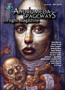
Review: Andromeda Spaceways #48

written by David Steffen

As I mentioned in my review of ASIM #47 last month, I enjoyed that first issue enough that I decided it was well worth my money to get a subscription. Well, my family’s money anyway. I was having trouble thinking of items for my Christmas list, and put a digital subscription to ASIM on there. So I got to celebrate Christmas a bit early.

One thing that I was very interested to see was whether or not the quality of the magazine would feel consistent from issue to issue. ASIM, you see, has a rotating set of editors who each take turns in the captain’s chair. #47 was edited by Patty Jansen. #48 featured Juliet Bathory. I’m quite happy to say that the quality between the two was consistently high. I very much enjoyed most of the stories–a much higher portion than I enjoy in a typical magazine. Not only that, but there are just so many stories–plenty of meat here to keep you entertained.

Now, on to the stories!

A Bag Full of Arrows by Mark Farrugia

This story focuses on a dragon-hunter’s wife and son. It’s an odd sort of dragon, who generally only eats those already dead. When the story begins the dragon-hunter has gathered a group of men to attack the dragon, but this is not his tale. This is the tale of the family he left behind, dealing with the aftermath of the attack.

Well titled, well written. A bit distant at times, and is a good complex character in a good complex problem. I really cared about what happened to the characters. She faces a difficult choice that defines the story, and which I found very interesting and well conveyed by the writing.

To Stand and Stare by Jayaprakash Satyamurthy–Venu is a professional slacker, avoiding getting a job however he can. He comes up with an ingenius idea to make a fake cell phone, which he uses to pretend that he is busy working, so that people will stop pressuring him to find a job. The trick works remarkably well… until the day his fake phone rings.

I loved the idea of this story, and though I’m not sure I really relate to his unyielding desire to do nothing at all, I still found him very likable. It kept me very interesting through these beginning stages, but later on it seemed to lose momentum and just tied everything up with a too-neat ending. I’d still recommend it for the first half.

The Number Made Flesh by Ross Murray–A tale of Death and his daughter, his heir. Death is fascinated with modern desensitization to death caused by media saturation, and the meanings attached to otherwise unimportant things like the number 13.

This was an interesting idea, and I usually like a good anthropomorphic personification, and I like see different interpretations of Death as a character. But I just found this one impossible to get into. It was very hard to get a handle on the setting and time period that the story occurs in, and it wasn’t until nearly the end when I was finally certain that this was Death. Rather than enhancing my enjoyment, this mystery just distracted me from other aspects of the story I might have enjoyed. Although I think the metaphor of Death watching death-saturated media and commenting on its affect on people, in the story it ends up being mostly about a guy watching TV.

Hobbit Query Letter by Peter Cooper. A hypothetical rejection letter that young writer upstart Mr. Tolkien might have received for his little-known manuscript Lord of the Rings.

Besides just being funny on the surface, it also makes an interesting commentary about yardsticks of equality shifting over time, and how one man’s trash can be another man’s treasure. As a writer I found this quite hilarious, and at least a little bit reassuring. As with other writers I’ve received many a rejection that blames this or that aspect of a story as though those qualities are universally undesirable by all editors, when in reality they just reflect a particular editor’s world view. I’m not sure how well this one will translate to someone without writing aspirations, but as a writer I found it quite entertaining.

Joey Blue and the Gutterbreed by Marty Young. Joey Blue lives on the streets, and every night lives in fear of the nasty and powerful creatures called the Gutterbreed that lurk in the shadows of night. Normally he would try to drink himself into a stupor to avoid the Gutterbreed, but on this particular night he finds a young girl, lost and alone and not in the best of health. To save her he must face his fears and avoid the temptations of alcohol and pass through the alleys where the Gutterbreed gather the thickest.

Throughout this story I was constantly trying to decide whether or not the Gutterbreed actually existed. In the end I decided it doesn’t really matter, especially once the stakes are raised with the introduction of the little girl. The Gutterbreed are clearly very real to Joey’s mind, and therefore they become a very real obstacle to saving the girl’s life, whether they are entities that exist outside of his fogged mind or not.

I wasn’t sure what I thought in the first half of the story, partially because I was trying to decide how much of it was real. In the end, this turned out to be my favorite story in this issue of ASIM. I liked Joey Blue. I wanted him to save the girl. And from his point of view the Gutterbreed were a terrifying and very real threat. All of this came together for a really great tale.

Halcyon by A. Dale Triplett The end of the world is nigh! Scientists have spotted an asteroid on a collision course with earth, and we only have four days to live. As if that’s not bad enough, global war breaks out in these final days. A last ditch effort is put together, a space mission to save the remnants of humanity. Most of the story takes place as the crew of this last ditch effort is visiting a bar for the very last time.

This story is just unrelentlessly depressing. I’m not saying it’s unrealistic but it is bleak as bleak can be about the nature of humanity, but is bleak without offering me any new insight to human nature or offering me any characters that I could at least root for. Among other things, the people who have been chosen to try to continue the species are spending their last day drinking heavily when they know darn well that they might need to emergency launch at any time if someone launches missiles at them. As if this story wasn’t bad enough, the last vestiges of humanity are at the mercy of drunk drivers.

The Whim of My Enemy by Amanda J. Spedding–An all out battle for survival on a train. It started with dozens, but the order has come that when the train stops, only 10 can be allowed to live.

Very action packed, non-stop happening, obviously lots of death. Shows in a very compact way how different personalities might react under extreme pressure. It kept me very interested to the end, and the author used the anticipation implicit in the setup very well. Very well done.

Radioactive Gumshoe Blues by Jamie Shanks–a 1920’s private detective story, with aliens! Benson Sterenko has taken over his brother’s P.I. business a few months after his brother’s disappearance. Benson’s sworn to find out what happened to his brother. One day, an FBI comes in, and starts talking about Sterenko’s brother, and an invasion of shapeshifting aliens, and it goes on from there.

It’s certainly an interesting idea, but I found it too slow and too exaggerated at the same time. I found the “goon” manner of speech distracting, especially constant verb number mismatches, and mispronounced words like “districk”, “crockydile”, and “precautionarial” that did nothing to enhance the story. They just set off copyediting alarms in my brain every few sentences (I know they were intentional, but without an actual purpose they were just a distraction to me). Also, I was put off by constant overblown self-descriptionsuch as “I was coiling my considerable muscles under me to spring at him like a Bengalese tiger”.

Ash by C.S. Cole A wartorn future where everyone takes a vaccine to help them breathe ash that is ever-present in the atmosphere, the ash of the enemy. Those who choose not to breathe ash are criminals and deviants.

Very interesting idea, very interesting setting, but I didn’t really feel like it was a full story.

Free Falling by Mark Welker–A future where pop media saturation has reached new lows, where suicides are covered extensively and from every angle, with up to the millisecond coverage and live footage. This is the tale of one such suicide.

Well told, very cool idea. The perfect length.

Holding by Melanie Rees–God calling tech support, trying to get a new atmosphere for the earth because this one is defective.

Very funny. Anyone who’s had to deal with phone tech supports will empathize, and the escalation to atmosphere replacement was a fun idea.

High Bidder by David C. Pinnt–South Dakota resident buys what someone claims to be the holy grail in an online auction site. It turns out that drinking from it turns people into zombies.

I spent the first 22 years of my life in South Dakota, and this story did not ring true in the slightest. It struck me as someone who has only barely heard of the state:
-The characters ALL talk with a stereotypical “back woods southern” kind of accent that I’ve never heard in SD before.
-The story takes place in relatively modern day, because there is a Brokeback Mountain joke. Yet everyone is still using party lines , the old fashioned phone setup where a whole neighborhood shares one common line, which have not been common for decades.
-Not only that, but he has internet access, which makes no sense to mix with a location that has party lines.
-A rural South Dakotan who has ever handled a gun is going to be pretty familiar with general gun terms, but this story constantly mixed up the details. A single gun switches characteristics from a rifle to a shotgun and back again. The ammunition is referred to as shells in the same sentence that it is referred to as a rifle. It sometimes makes a small hole like a rifle, and sometimes a big blast like a shotgun. The writer really ought to have checked his gun details to get them straight, and someone else should’ve double-checked it.

Beyond all the South Dakota and gun inaccuracies, the story was an unremarkable zombie story. The only thing that really struck me as original is that the holy grail is the thing that spawns zombies, for no apparent reason. The story might’ve been fair-to-middlin’ if not for the inaccurate portrayal of South Dakota and the complete botch of gun details.

Lucky Pig Studio: Grand Opening!

written by David Steffen

I have some very exciting news for you. Joey Jordan (our resident artist) and I are joining forces once again in a different webspace, this time to design and sell t-shirts (and other novelties) with designs of our own devising upon them. The name of our store is Lucky Pig Studio–just click on the name to go check out our wares. You can see a select few of our designs in this article, but we have many more available at the store, each of which can be printed on many types of goods, including t-shirts, tote bags, coffee mugs, baby clothes and more. If you order soon your order will hopefully arrive in time for Christmas, making a lovely stocking stuffer for your family or friends. We think there’s a little something there for everyone. We have 12 designs posted for now, to give you something to browse through.

Joey is the talented member of the duo. She is a fantastic artist and a truly nice person, and I’m happy to be working with her. In case you didn’t know, she’s the one who provided our awesome site art, as well as the pieces showcased in the Diabolical Art section of our site. She’s a professional illustrator, which is very clear from the quality of her work.

“What does David contribute?” I hear you wonder aloud.  Well, I just try to keep up, mostly. Some of the designs are created and perpetrated by my own hand. You can tell which ones they are because they’re the ones that look like they were not made by a professional artist. What I lack in skill, I try to make up for with humor and enthusiasm. I like to make designs that make me giggle, and I hope they make you giggle too.

We’re just getting started, so anything you can do to spread the word will be greatly appreciated. If you know someone who would enjoy our wares, please, please share a link with them. Post to your blog. Wear one of our t-shirts to a science fiction convention. Hire a sky writer plane to write our URL in the sky above New York City. Whatever you can do, thank you very much in advance.

We very much look forward to hearing from you, and we hope that you like what we’re putting together. And we’ll be feverishly working on new designs, so please stop back every once in a while to see what’s new. This shop is of the small, temporary variety. In the long run we plan to assemble a bigger shop with more products and more designs, but we are very excited about this and wanted to launch before Christmas. The homepage of the new improved store will be here.

Also, with the current kind of shop we’re working with, there’s no way to disallow certain unwise combinations, so you’ll want to avoid those yourself, particularly:
-If there is a caption with black font, you won’t be able to see it on black and some dark shirts.
-For light colored but non-white shirts, CafePress does not print white ink for white/gray parts of the image. So, the white part of a design printed on a yellow shirt will just be yellow instead.

Thank you so much for stopping by!